
App Layout
The Spark App Layout design pattern provides a highly modular and scalable structure ideal for desktop and tablet back-office tools.
This layout ensures user productivity and ease of navigation, prioritizing content visibility, consistency, and responsive adaptability. It leverages MUI components for a cohesive implementation while emphasizing flexibility and customization.
TL;DR
The Spark App Layout ensures consistency with unified themes and structured layouts, enhances accessibility with high-contrast colors and supports scalability through a modular design that accommodates growth without layout overhauls.
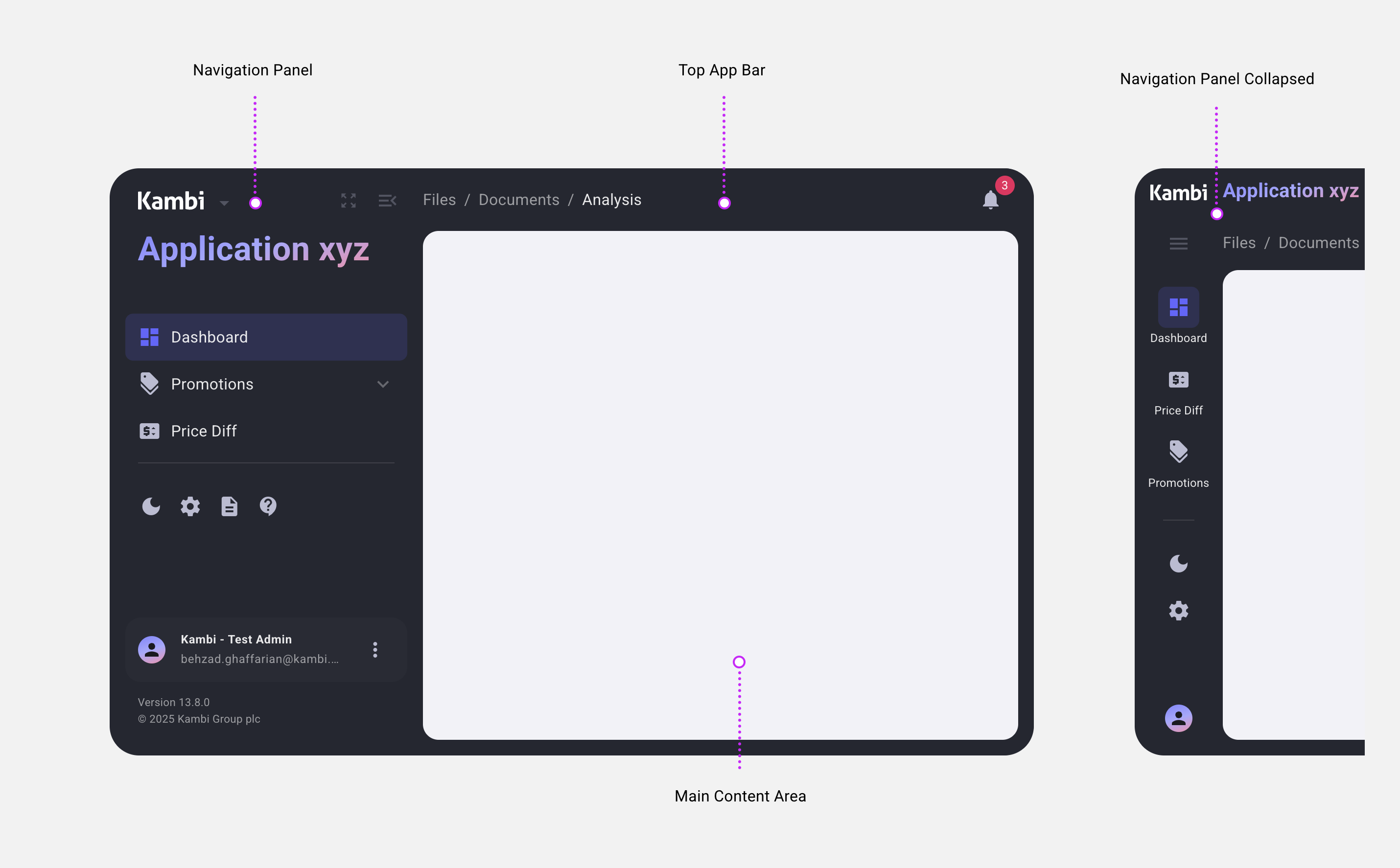
Parts of Layout
Navigation Panel: Fixed width, collapsible, dark-themed for streamlined access. It includes primary navigation, app settings, user profile access, and collapsible sub-menus. Open by default on larger screens, collapsible for smaller ones.
Main Content Area: Dynamic, responsive, and task-focused. Emphasizes task-critical content with a minimalist design, supporting light and dark modes.
Top App Bar: Context-sensitive header for high-level actions, with adaptive visibility. Displays app-relevant actions and matches the dark theme of the Navigation Panel.
Primary Benefits
Consistency: Unified themes and structured layouts ensure a professional appearance.
Accessibility: High-contrast colors and native browser behaviors enhance usability.
Scalability: Modular design supports growth without layout overhauls.
Parts of Layout
Navigation Panel: Fixed width, collapsible, dark-themed, navigation for streamlined access.
Main Content Area: Dynamic and responsive task-focused space.
Top App Bar: Context-sensitive header for high-level actions, adaptive visibility, aligned with app-specific needs
Left Panel
Provides primary navigation, app settings, and user profile access.
Default State
Open by default on desktop and large tablets; collapsible for smaller screens or specific app requirements.
Theme
Dark mode for visual consistency and focus on the main content.
Contents
App logo, application name.
Navigation items grouped into logical sections.
Collapsible sub-menus (e.g., "Promotions").
UI buttons (Theme, Menu, Full Screen).
User profile
App Info
Behavior
Fixed width (open/closed) for stability.
Own vertical scrollbar for lengthy menus.
Resources
Main Content Area
Dominates the interface to emphasize task-critical content.
Theme Adaptation
Supports light and dark modes to suit user preferences.
Behavior
Occupies remaining space dynamically.
Uses native browser scrollbars for consistent scrolling experience.
Design
Minimalist, clutter-free space for content-heavy tasks.
Fluid responsiveness ensures usability across various screen sizes.
Top App Bar
Displays app-relevant actions and information, adapting to context.
Visibility
Appears only when necessary, optimizing screen space.
Sticky or non-sticky based on content importance.
Theme
Matches the dark theme of the Left Panel.
Contents
App-specific actions and context-sensitive options.
Device Support
Desktop and Tablet: Fully supported, leveraging responsive designs for different screen sizes.
Mobile: Not a priority, as the layout targets back-office tools primarily for desktop users.
Design Principles Achieved by Spark App Layout
The Spark App Layout is meticulously crafted to address specific user needs, ensuring a highly functional, professional, and user-friendly interface. The following principles are not just aspirations but tangible outcomes realized through this layout's design:
Enhanced User Experience
Trust and Professionalism: The clean and consistent design of the layout fosters confidence, ideal for high-stakes back-office workflows.
Improved Productivity: Features like collapsible menus, responsive layouts, and light/dark mode options streamline tasks and reduce distractions.
Lower Cognitive Load: A clear hierarchy, intuitive navigation, and clutter-free main content area allow users to focus on critical work with ease.
Clear Hierarchy and Content Focus
Streamlined Navigation: Logical grouping and separation of navigation elements ensure users can find what they need quickly.
Content Dominance: By prioritizing the Main Content Area, the layout ensures task-critical information always takes center stage.
Accessibility Built-In
High-Contrast Visuals: The dark-themed Left Panel and adaptable Main Content Area improve visibility for diverse user needs.
Native Scrolling: Integrating native browser behaviors ensures smooth performance and universal compatibility.
Light/Dark Modes: These customizable options enhance usability by reducing eye strain and accommodating user preferences.
Scalable and Future-Ready Design
Modularity: Core components like the Left Panel and Top App Bar are designed to adapt seamlessly to evolving app needs.
Growth-Oriented: Logical organization and the ability to add new features without disrupting the existing layout ensure long-term usability.
By embedding these principles into its core, the Spark App Layout delivers a robust, scalable, and user-centered solution that empowers productivity and clarity in back-office environments.